
Designing for something so grounded — and making it feel elevated.
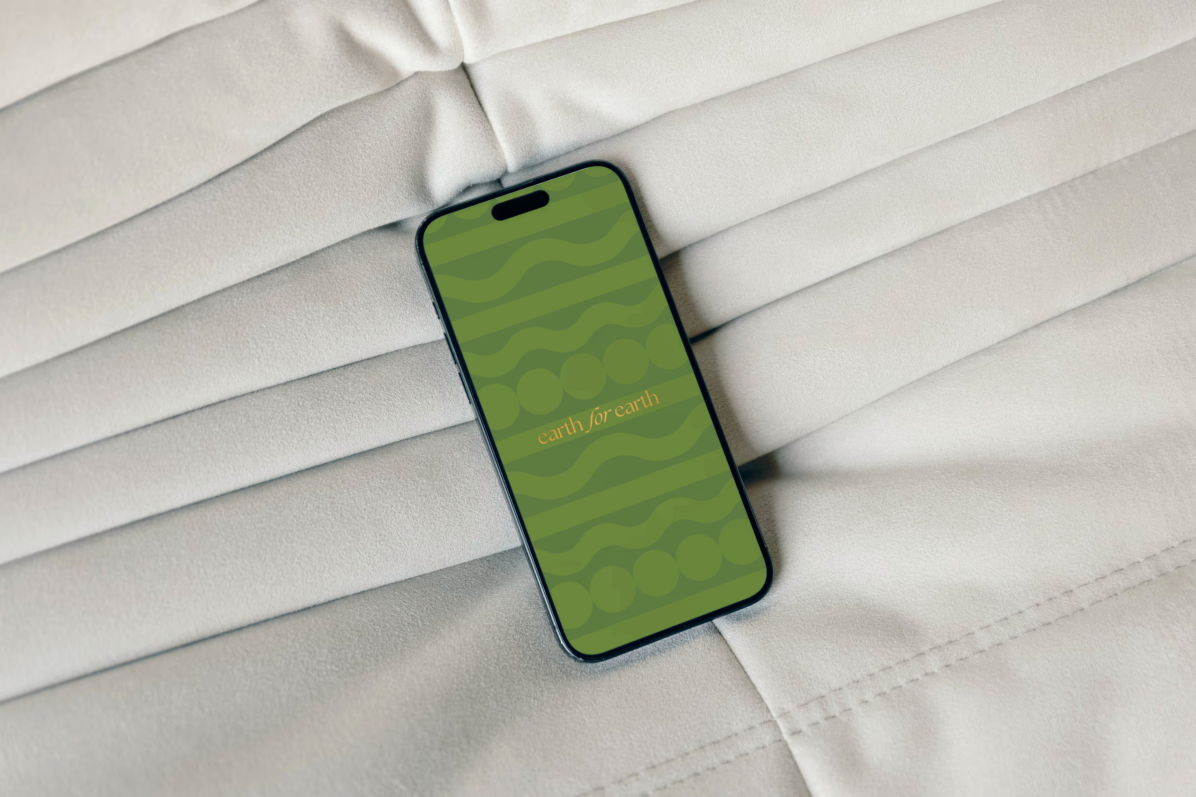
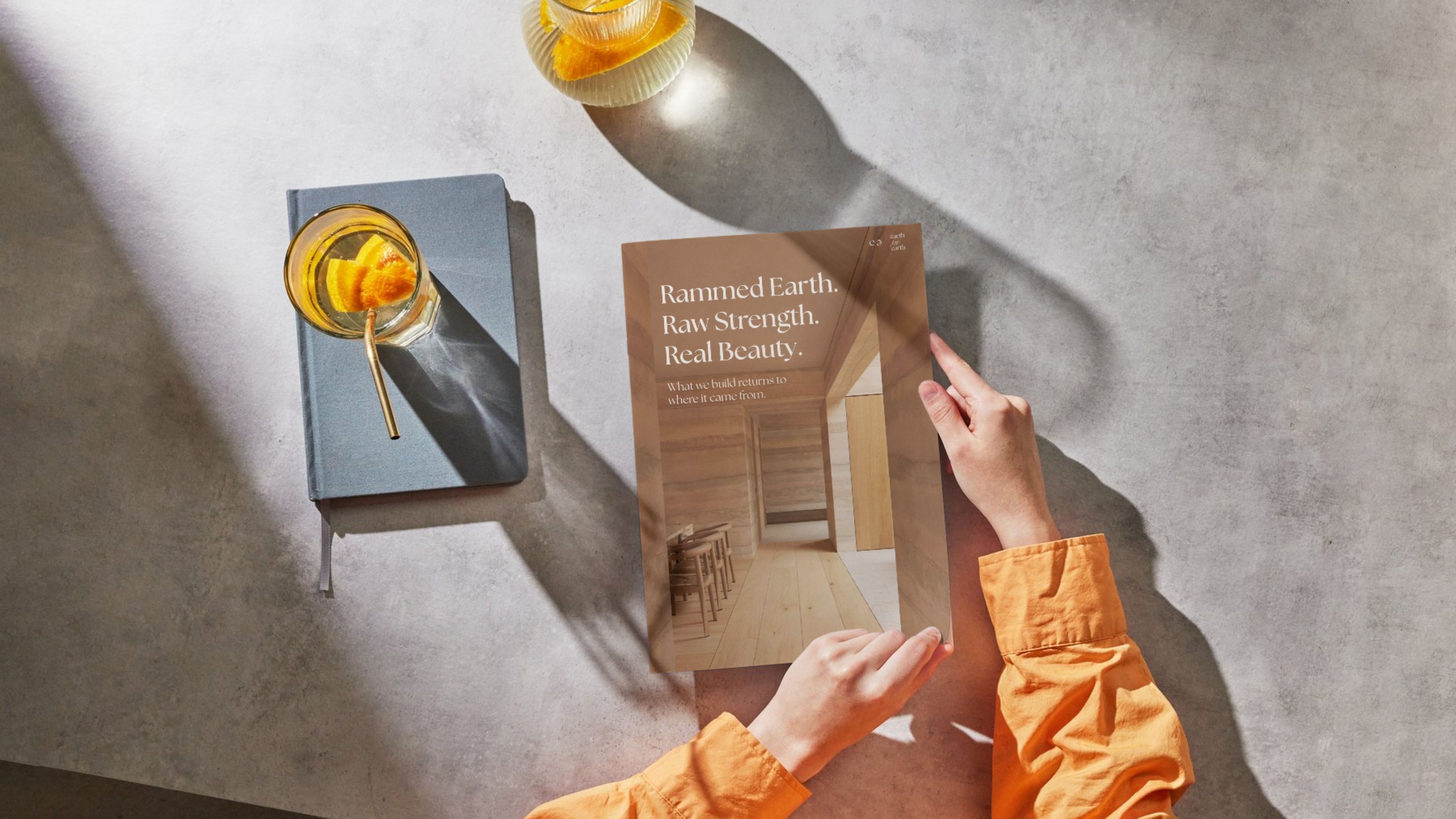
Earth for Earth needed a brand identity that could hold both depth and lightness—a system that felt tactile, rooted, and yet modern. Inspired by rammed earth, we drew from the concept of soil layering to craft a layered visual language—one that could stretch across formats while staying quietly connected to its core.

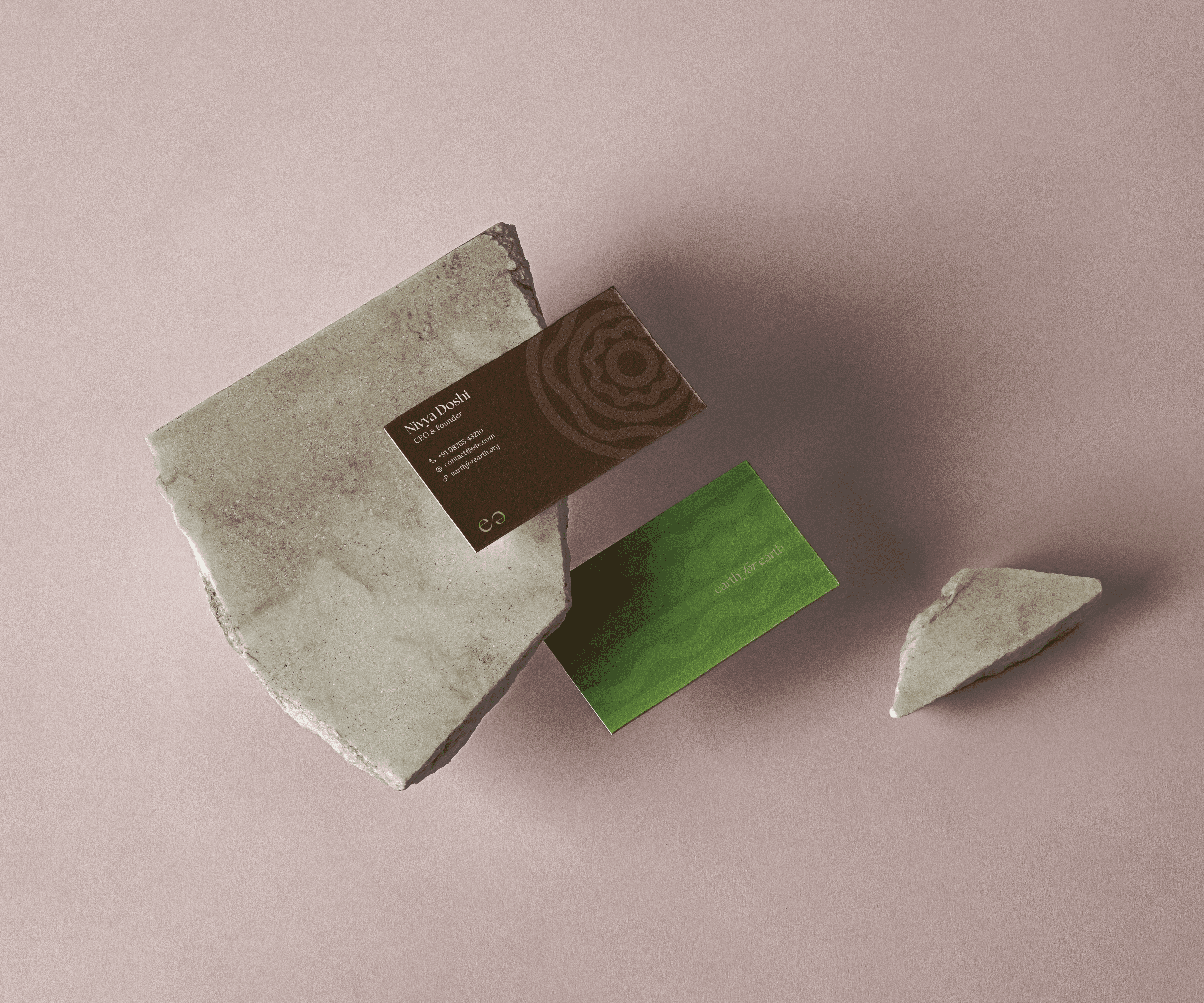

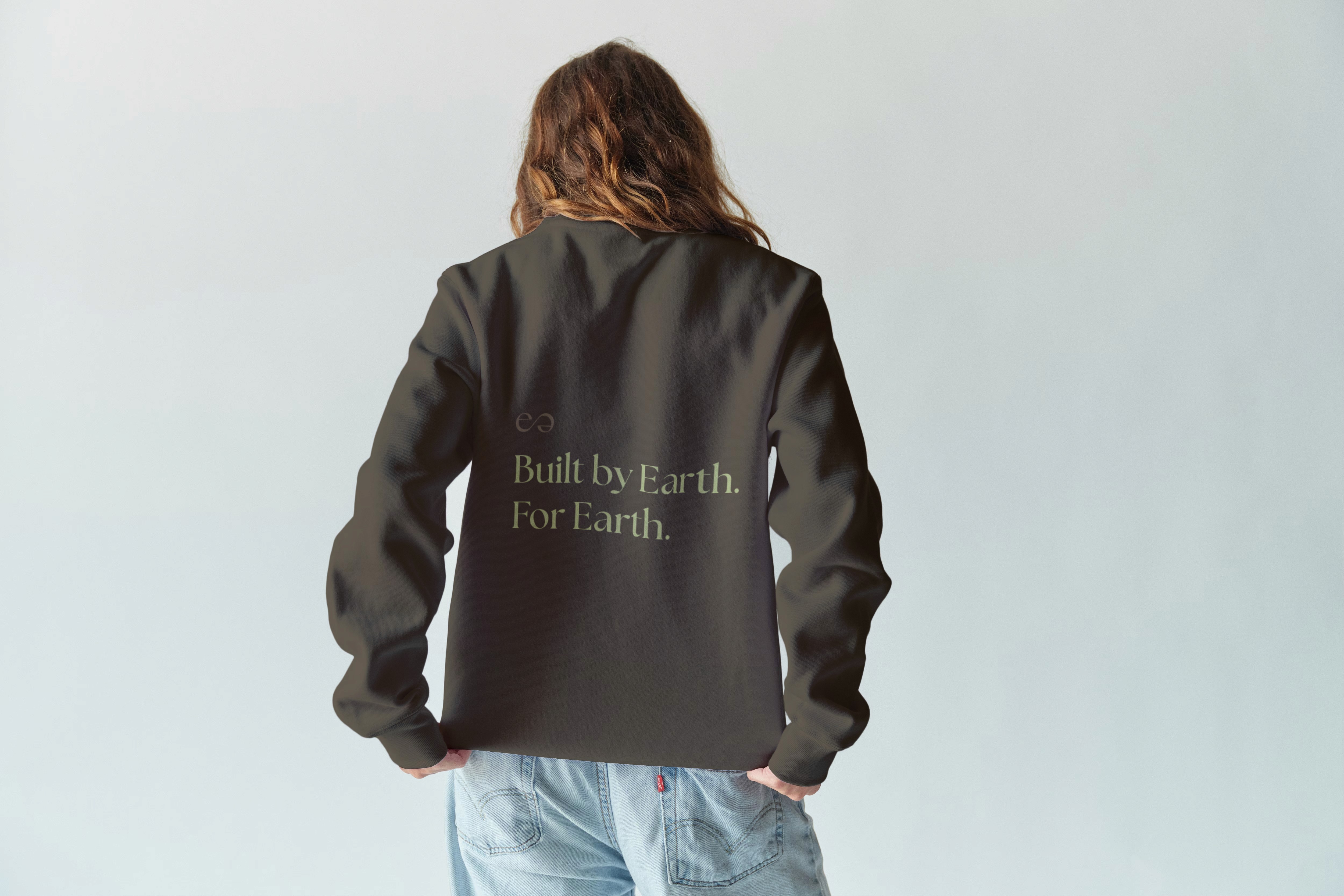

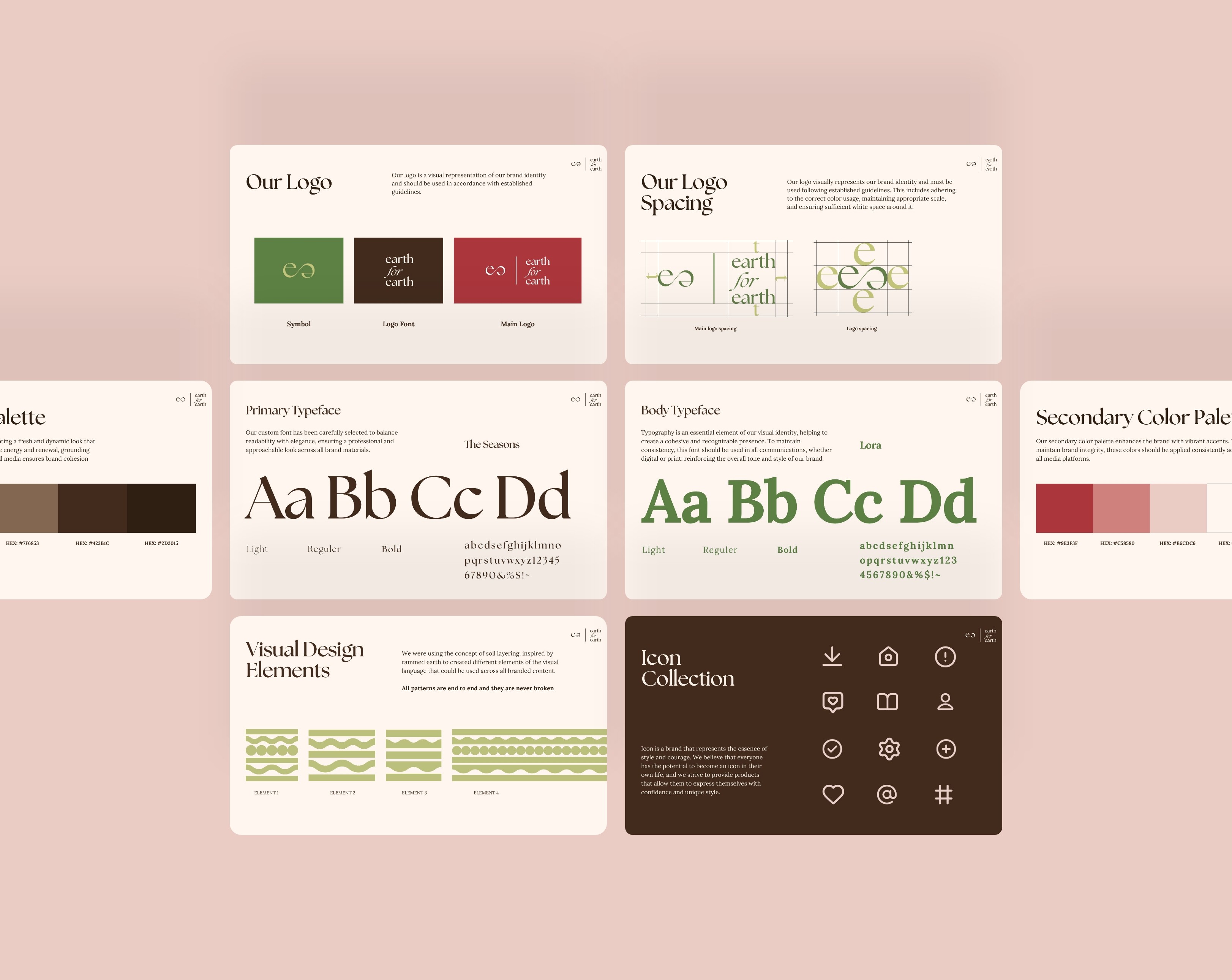

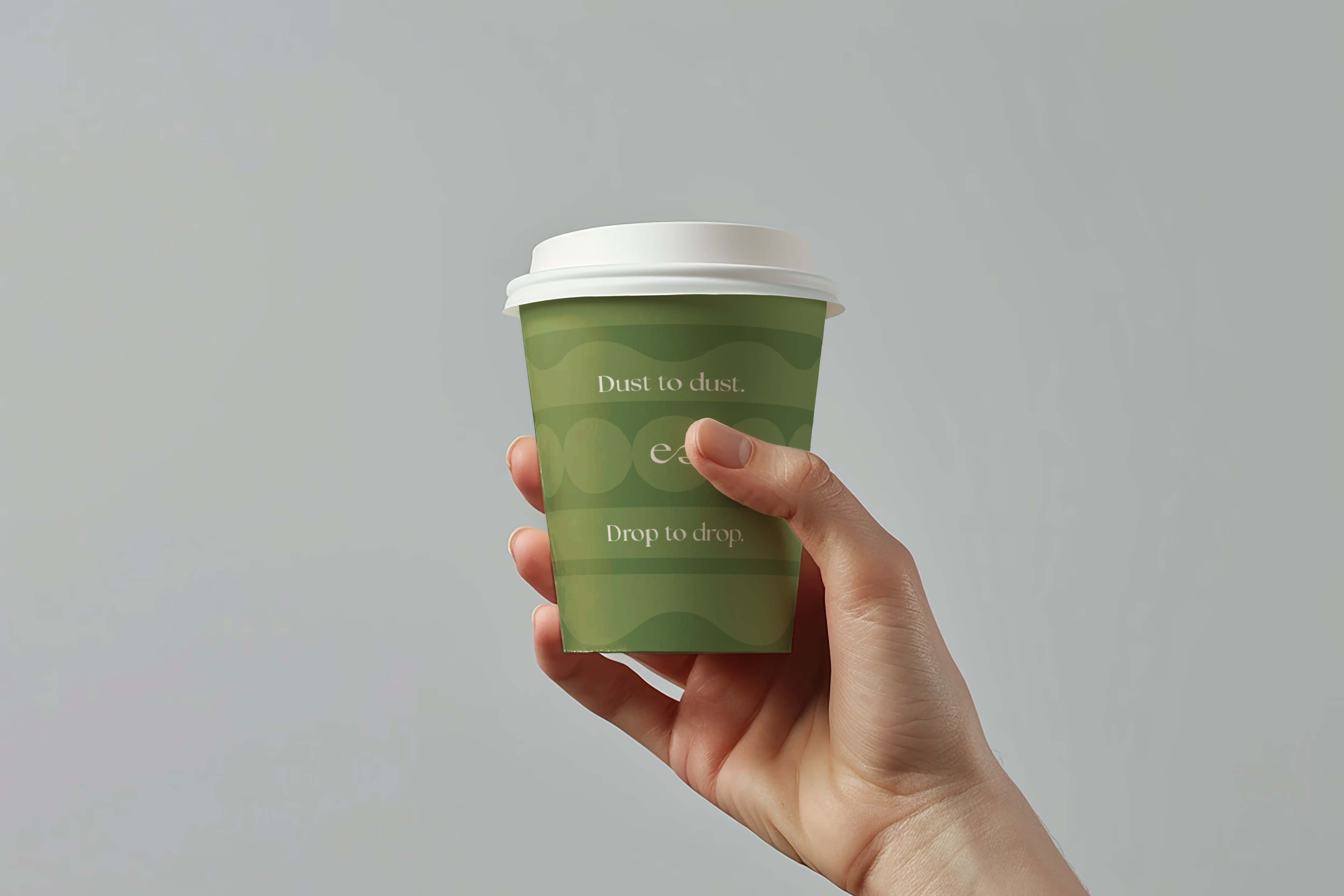
Every element, from logo to palette, was built to feel like Earth: calm, collaborative, and intentional.
What emerged was a quiet, confident identity system rooted in materiality and intention. From the layered representation in the visuals to the style of imagery, every detail reinforced Earth for Earth’s mission: to reshape space through sustainable collaboration.
Explore More.
[ekk aur?]